Subway Sandwich
Self Service Kiosk
I chose to design a self-service kiosk interface for Subway for two main reasons. First, in North America Subway currently lacks a dedicated self-service kiosk option. Second, on a personal level, I often find it challenging to interact with employees at Subway either due to difficulty understanding them or not knowing the names of specific ingredients. This experience often leads to anxiety and frustration. I would much prefer the ease and independence of using a self-service kiosk.
-
ROLE
UX Research
UI Design
-
CLIENT
Student project for "Design for New Technologies" course
-
TIME
Fall, 2024 (4 weeks)
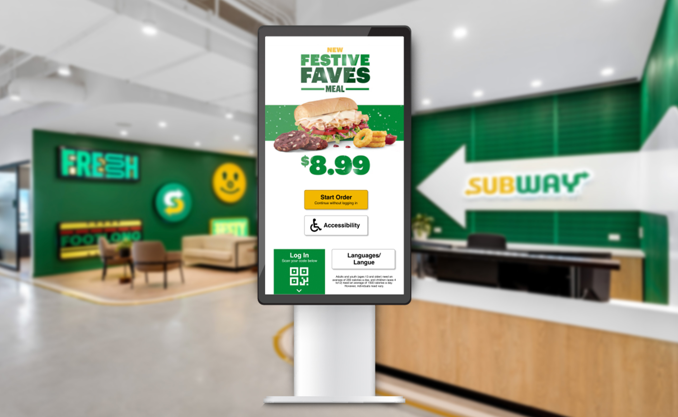
PROTOTYPE
Please click on the Figma prototype below.
PURPOSE
The purpose of this project is to create an intuitive, efficient, and accessible self-service kiosk experience that simplifies the ordering process for Subway customers.
The current interface presents several challenges, including unclear navigation, lack of feedback, and an overwhelming customization process, especially when too many choices are presented at once.
My goal is to design a new solution that prioritizes usability and focuses on a truly user-centered experience.
RATiNG & REViEW
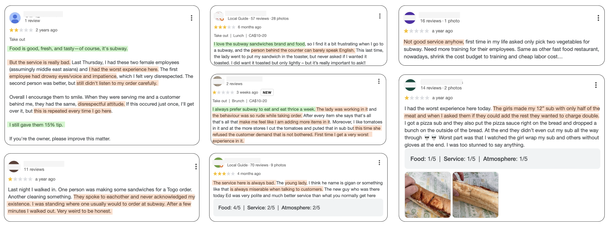
In my research and analysis of Subway, I discovered numerous reviews from unsatisfied customers who shared similar frustrations to my own. Reading these reviews provided valuable insights into what’s missing and highlighted the importance of Subway considering a self-service kiosk to help reduce customer frustrations and improve the overall experience.
Pain Points
- Service is bad and some customers has worst experience
- Disrespectful and rude attitude
- No change in bad service and attitude
- Some customers prefer to go to Tim Hortons after bad experience
- Customers feel miserable
- The food is not fresh (eg, “cucumbers were yellow, lettuce was brown”)
- Some employees can barely speak English
- Feel sick due to too much sauce and or/dark brown lettuce
- Food and service are getting worse
- 12” sub for half of the meat
- Two employees were talking to each other and didn’t acknowledge customer’s existence
Gain Points
- Food is good, fresh and tasty
- Some customers still willing to tip
- Normally eat Subway for lunch
- Always prefer Subway to eat twice a week
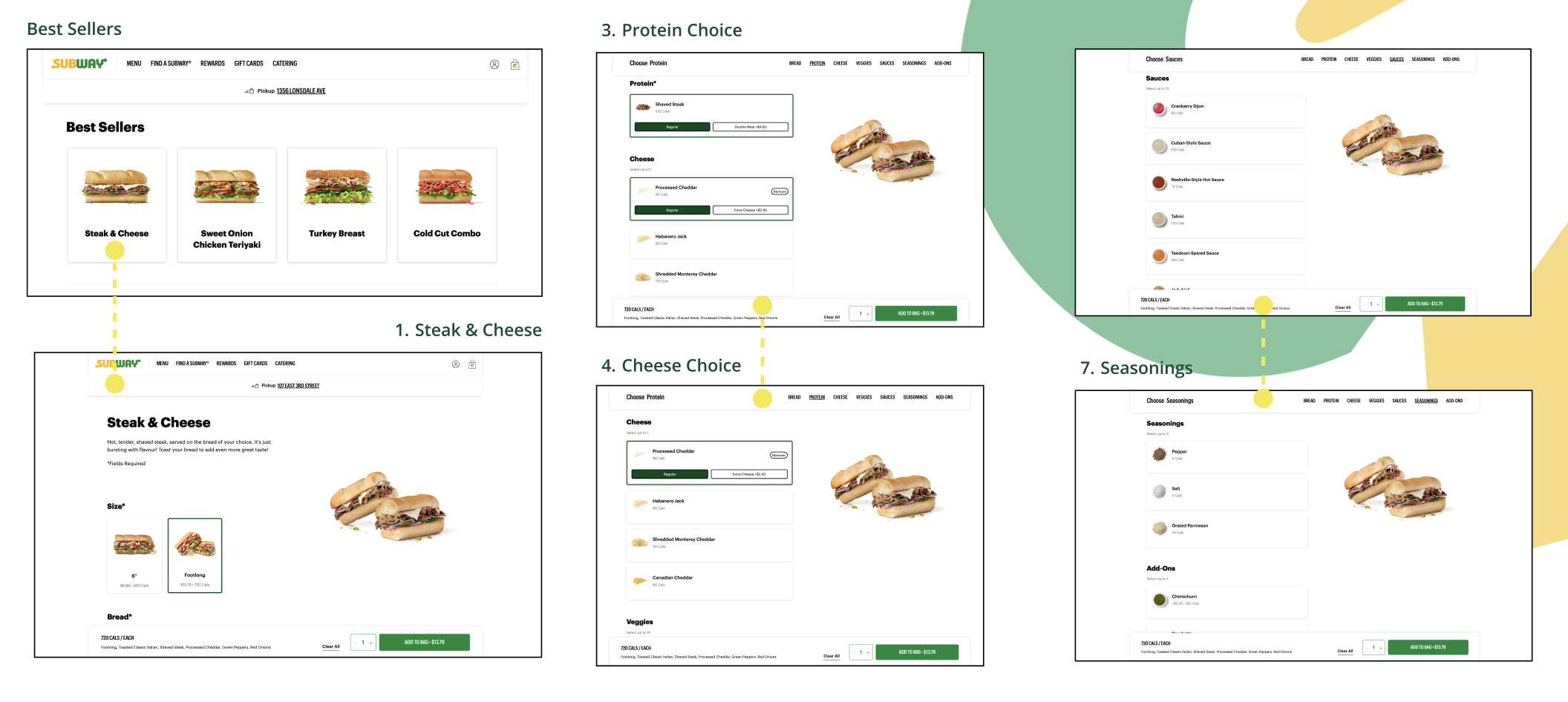
HEURISTIC REViEW
I have done the Heuristic Review of the Subway’s official website, specifically the homepage and the ordering process. For the ordering process I decided to go with my favourite Steak & Cheese sandwich, which surprisingly I could only find in Best Sellers section, but not in “Menu: Subway Series” landing page. I paid extra attention to the customization process, which includes the Size, the type of Bread, Protein, Cheese, Veggies, Seasonings, Add-Ons and here is what I found:
-
1. User Control and Freedom:
- Users have the freedom to skip or change options without locking them into choices. I think it is great for customization.
-
2. Consistency and Standards:
- Consistency is maintained across each customization step, with the same layout and action button ("Add to Bag").
-
3. Visibility of System Status:
- Each selection screen displays the user's choices on the right (e.g., selected bread type, cheese). A progress indicator or breadcrumb trail could further improve this, making it clear how many steps are left.
RESEARCH PROCESS
After initial prototype I have conducted 3 interviews. I have recorded the interviews by using Voice Memos app and by taking notes during the interview. I turned all the answers and main ideas into notes and placed them next to answers so I can see the main points and find some insights.
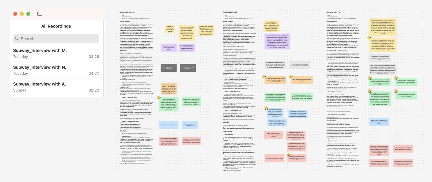
INSiGHTS
-
1. Optimize the Display of Sandwich Descriptions
- Participants preferred seeing sandwich descriptions before combo options and expressed interest in clearer details about what’s included in each sandwich.
-
2. Improve the Transaction Flow and Visibility of Progress
- Some users found the transition between customization and finalizing the order slightly disjointed and preferred more visible steps.
-
3. Clarify the Customization Process
- One participant mentioned confusion regarding the “less, medium, more, none” options and suggested a clearer interface.
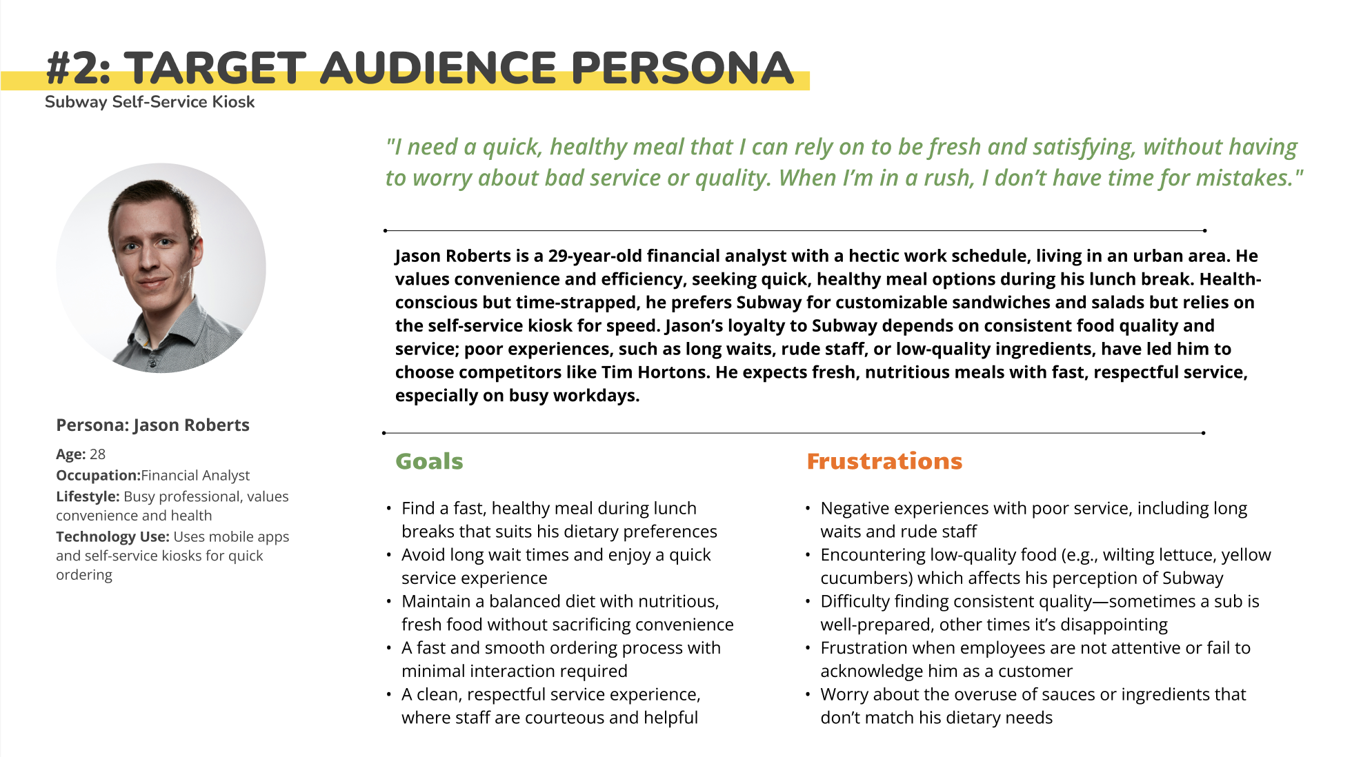
PERSONA
Based on my identified recommendations and key goals, I developed a distinct persona to guide my focus and address user needs effectively.
DESiGN PRiNCIPLES
- Simplicity: Keep the interface clean and easy to navigate with minimal distractions.
- Efficiency: Optimize the user journey for speed and quick decision-making.
- Personalization: Allow users to customize their orders without overwhelming them with choices.
- Visual Appeal: Use high-quality images and clear text to enhance the user experience.
- Consistency: Ensure uniformity in design elements across the interface.
- Accessibility: Design with accessibility in mind for a diverse range of users.
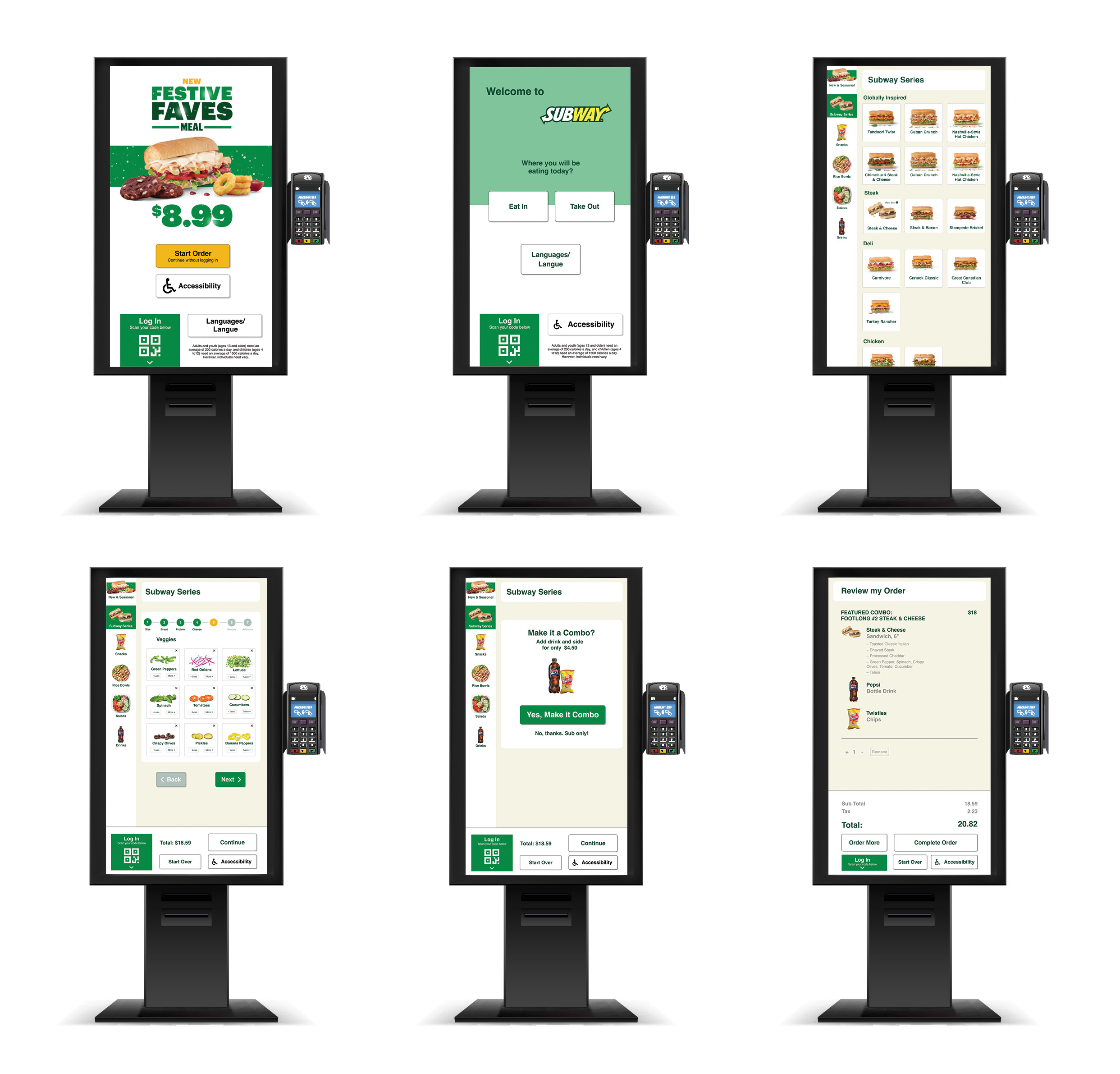
USER FLOW
Customers start at the welcome screen, select their meal from categorized menu options, and customize their order step by step (bread, protein, toppings, sauces). The system suggests combo upgrades before showing an order summary for review. Once confirmed, customers complete payment, receive an order number, and pick up their meal when ready. The kiosk ensures a fast, intuitive, and seamless ordering experience.
MOCKUPS
SUMMARY
Based on the feedback provided, the overall experience with the Subway self-service kiosk prototype seems to be quite positive. Users appreciated the clean, intuitive interface, which made navigation easy. The visual design, such as clear images and the use of colors like yellow to guide actions, was well-received. The progress bar, breadcrumb navigation, and step-by-step process were found to be helpful in keeping users informed and reducing confusion.
Key strengths of the prototype included its efficiency in saving time and reducing miscommunication. The inclusion of descriptions for each sandwich and the ability to customize options, such as “more” or “less” of certain ingredients, were noted as useful features. However, some users suggested improvements, such as making the "None" option more intuitive and adjusting the order of certain pop-up windows for better flow.
In terms of payment options, the kiosk was considered secure and intuitive, with straightforward icons and navigation. While users found the ordering process to be efficient, the transition between customization and finalizing the order could be improved by presenting the sandwich description first.
Overall, the self-service kiosk was seen as a convenient and time-saving option, especially when compared to traditional counter ordering. Users expressed a preference for kiosks as they allow for a more streamlined experience without the need to wait in line. Despite some minor suggestions for improvement, the kiosk met users' expectations for an easy, fast, and visually engaging ordering experience.