Seed the Hope
Personal Initiative
I am the founder and organizer of a social project called Seed the Hope, which supports survivors of domestic violence, particularly single mothers currently staying in transition houses. The aim of this project is to help individuals cope with post-traumatic stress through planting and growing indoor edible plants and flowers. It also includes an educational component to teach young children about the process of planting.
-
ROLE
UX Research
Service Design
Branding
Webdesign
-
TOOLS
Figma
Photoshop
Illustrator
InDesign
Watercolor
-
CLIENTS
Non-Profit Organizations
-
TIME
Summer, 2021
January, 2025 - Present
INTRODUCTION
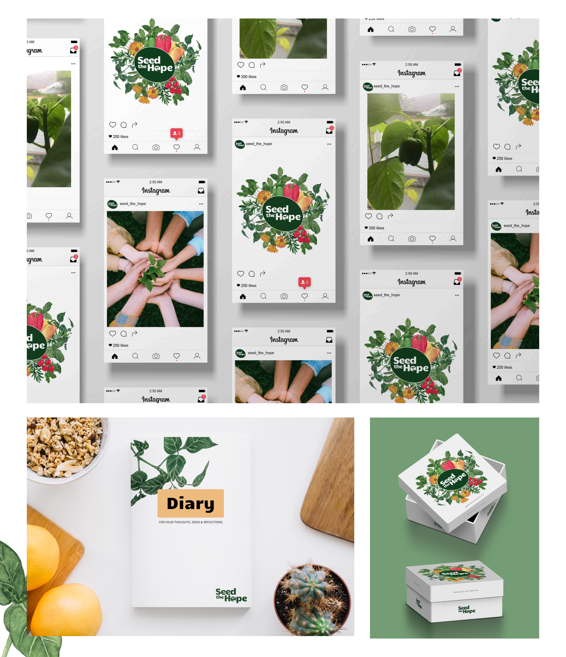
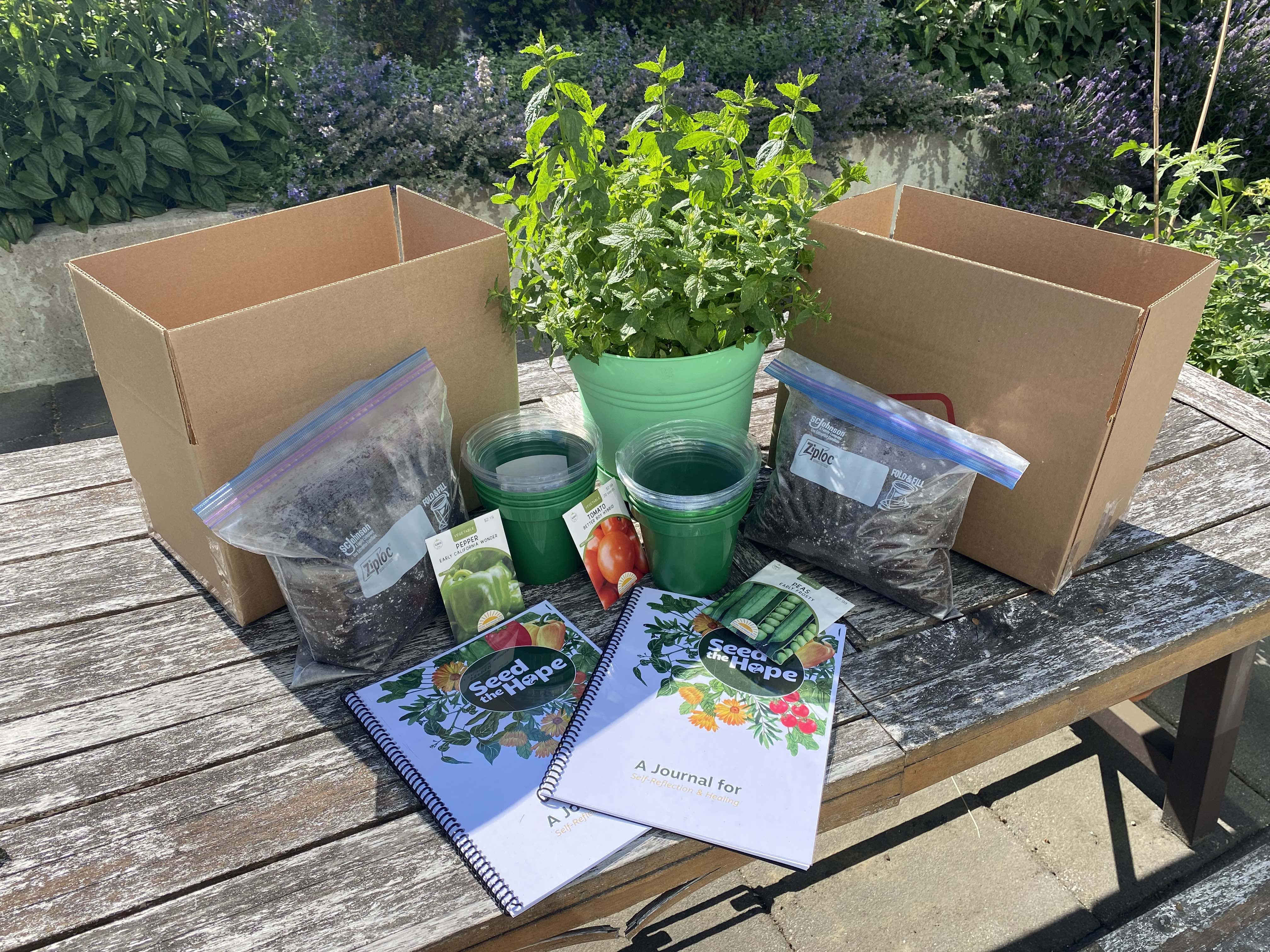
As part of this initiative, I plan to produce a gift box that will include seeds, soil, pots, and a diary. The design of the package will evoke a natural and organic feel. To bring this vision to life, I’ve created sketches of herbs and flowers, which I have painted with watercolor. Additionally, I’ve worked on creating brand statements and designs, conducted interviews, developed personas, and designed wireframes and user interfaces. The final step will be to develop a healing journal, which will then be tested alongside the gift box.
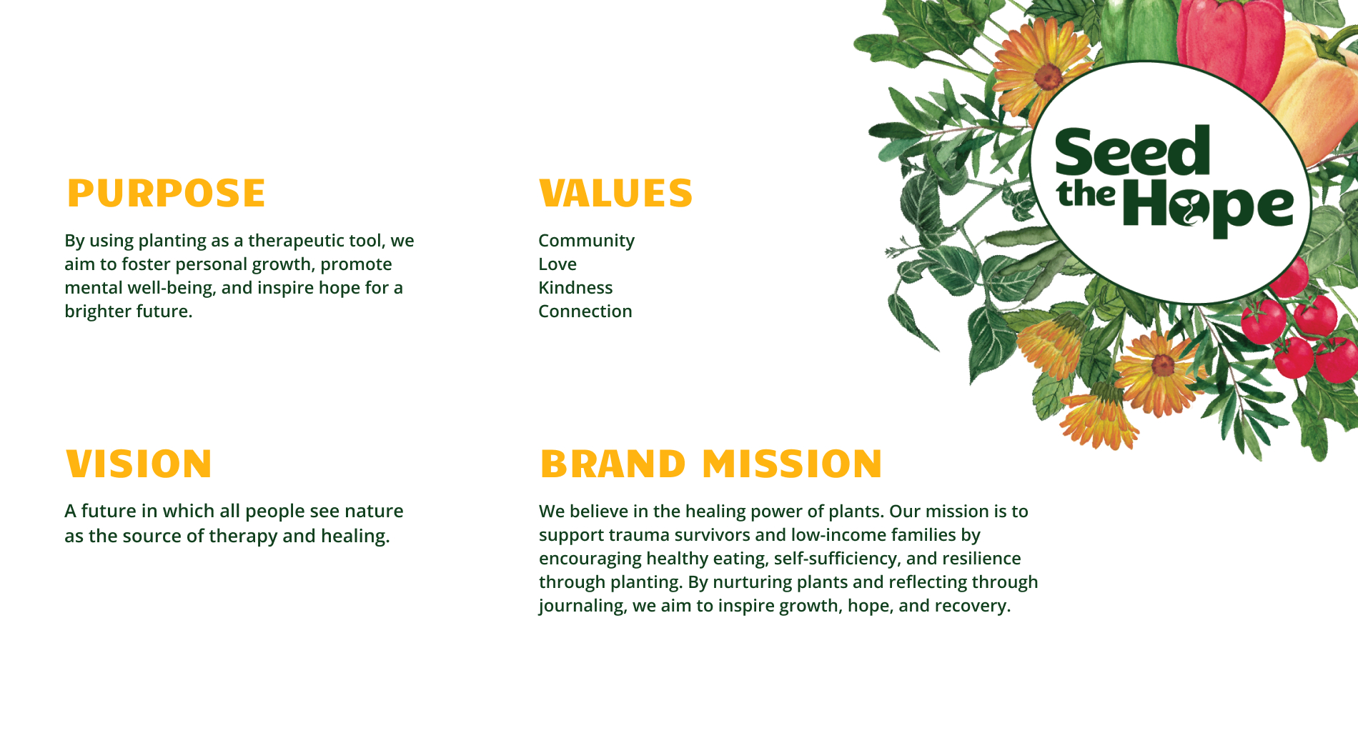
WHO WE ARE?
The way I see Seed the Hope is a nonprofit organization dedicated to healing and growth through the power of plants. We provide resources and support for trauma survivors and families in need, helping them cultivate edible plants as a source of nourishment, resilience, and hope. Below are the Brand statements that I came up with for this project.
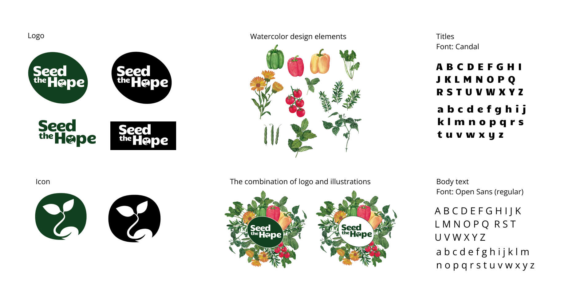
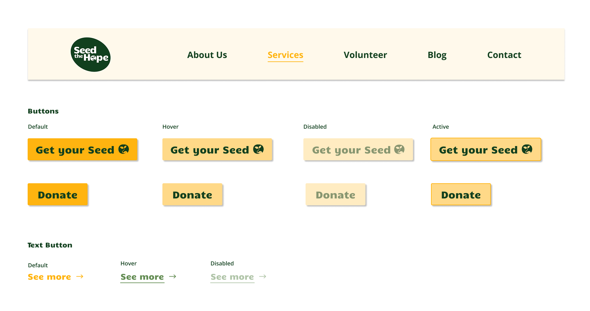
ViSUAL LANGUAGE
-
Logo Variations:
- Different formats for various applications.
-
Icons:
- Sprout - growth and hope. Easily recognizable and adaptable.
-
Watercolor Design Elements:
- Natural and organic feel - theme of gardening and plant therapy. Warm, welcoming, and earthy tone to the brand.
-
Illustrations:
- Brand focus on planting and growth. Can serve as a decorative asset to the brand.
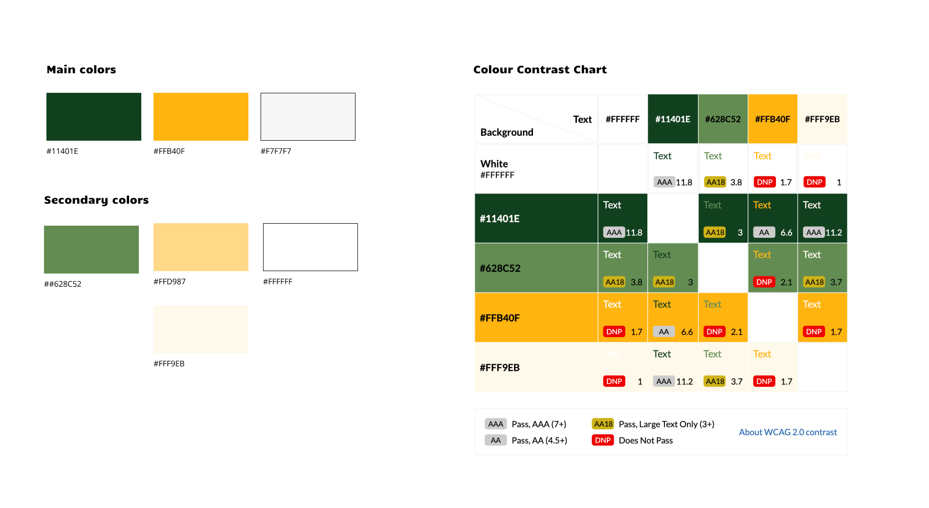
COLOR CONTRAST
For the “Seed the Hope” website, I conducted a color contrast analysis to ensure accessibility and readability across different text and background color combinations. The goal was to meet WCAG 2.0 guidelines for contrast, which are critical in creating a design that is inclusive for all users, including those with visual impairments.
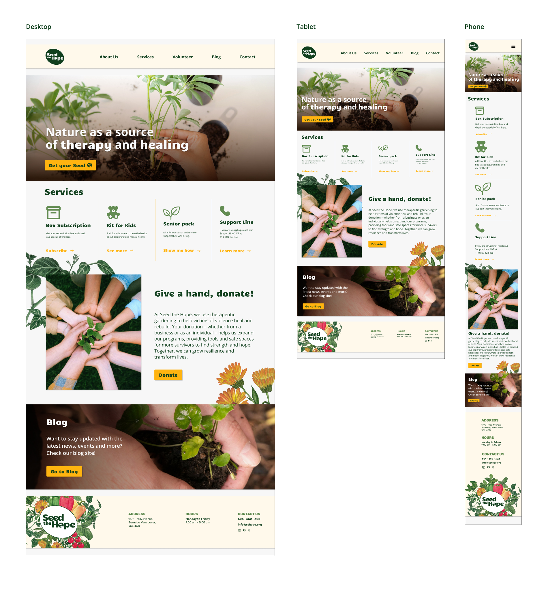
THREE BREAKPOINTS
The “Seed the Hope” website is designed to promote a nonprofit organization that uses therapeutic gardening as a tool for healing survivors of abuse. The design showcases the project’s commitment to wellness and community support by providing information on services, donation options, and blog updates. The site is responsive, with tailored layouts for desktop, tablet, and mobile views to ensure optimal usability across devices.
Each version of the design (desktop, tablet, mobile) keeps the brand’s organic and healing theme, with earthy colors, images of plants and hands, and warm tones that evoke a sense of growth and nurturing. The website structure is clean and intuitive, guiding users through the main sections, such as Services, Donation, and Blog, with clear call-to-action buttons.
OUTCOME
These elements reflect brand’s values of hope, growth and sustainability in natural and approachable way. The use of watercolor illustrations alongside simple typography and icons creates a harmonious aesthetic suitable for a brand focused on healing through planting.
I believe the overall design is well aligned with the vision and mission of the initiative. A cohesive and impactful visual identity communicates the project’s focus on healing, nature, and support for survivors. By incorporating elements like organic colors, nature-inspired illustrations, and thoughtful typography, the branding mockups effectively convey the project’s values. If tested with the target audience, the designs will ideally resonate emotionally and foster trust in the initiative.